With the emerging popularity of carbon bike frames, it really isn’t too much of a surprise to see more manufacturers begin to produce more products out of this trendy again, material. But not only are there new products from established companies being created from carbon, but there are also new companies stepping into the light—welcome Joystick Bicycle Components.
Now I’ll be completely honest, I don’t know too much about Joystick (we will work on that though!), but I know a nice website when I see one, and Joystick’s is one that smacked me upside the head the moment my browser finished loading!
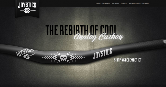
Joystick’s logo sets it off in the right direction. The typeface chosen works really well, conveying strength, without being corporate or boring. The script typeface chosen for ‘Bicycle Components’ helps with the playful, not so serious side, but doesn’t go as far as making it seem childish, holding a great sense of cleanliness and professionalism.
The real fun begins with the icon—an ‘x’ with a pixelated skull—much like the early day, low-fi video games. It says, mountain biking is dangerous and rad, while also saying, we mean business—and come on, we’re mountain bikers, skulls are a must at some point… The icon also ties in the old low-fi video games with the brand name, Joystick—a fun theme that is successfully throughout the rest of the site—headers, textures and background elements.
What’s great about the site is the successful one page format, using some nice javascript to scroll to each section of the site, rather than loading up a new page. Once you have moved beyond the ‘fold’ of the first page, the company icon shows itself in the bottom right of the screen with ‘top’ written above it, indicating a way back to the to of the page, and the main navigation.
The site contains information on Joystick’s first product, a carbon bar (which has numbers that we are loving the sound of!), a look into their Twitter activity, a contact form and some imagery of their bars.
What we think would be great is to ‘fix’ the main navigation to the top of the screen, enabling users the ability to click to sections they like, without scrolling or clicking back to the top in order to do so. However, with as little information as there is on the site, many may feel this unnecessary (it’s just a nice to have in our opinion). Design and functionality aside, it would be awesome to read more about the company. I’m sure there are people out there that would like to know what they are all about.
A way for non Twitter users to follow them would be great as well, they do have a Facebook page (go give ‘em a Like), but you would never know it from the site. Overall, if their products are designed anywhere near the quality of their website or branding and graphics, it’s bound to be a wicked product. We may just be in the game for a couple of sets of carbon bars this year, and these are at the top of the list!